Our Solutions | Reporting
Understand your business with rental reporting and business intelligence
Take control of your rental business with powerful reporting tools that help you make smarter, data-driven decisions.
Rental Reporting Designed to Build Your Success
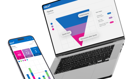
Rental Equipment Reporting
Access and understand key business data with ease. Use pre-configured business intelligence reports or create custom reports designed for your specific needs, and send them automatically to your team.

Business Intelligence
Gain real-time insights into your rental business with Microsoft Excel pivot tables. With accurate data at your fingertips, you can make informed decisions that drive growth.

Dashboards
Turn complex data into clear, actionable insights with Power BI. Real-time dashboards give you a snapshot of key metrics, helping you monitor performance and make smart decisions on the fly.

Why choose MCS Rental Reporting Services?
MCS’ business intelligence and rental reporting services give you a complete, easy-to-use solution for understanding your rental business data, empowering smarter decision-making to support growth.

Comprehensive Reports
Access 50+ standard reports covering all areas of your business, including utilisation and customer turnover. Customise them with your branding and summarise key business metrics quickly.

Deeper Understanding
Get instant insights with simple Power BI dashboards. Track top customers, equipment group revenue, asset utilisation averages, and project values for the future months.

Improved Visibility
Dive into your business data with raw data analysis. Use pivot tables in Microsoft Excel to explore customer spend, sales performance, fleet performance, and more.

Smarter Investments
Leverage rental equipment data to make smarter investment choices. Identify high-performing assets and those with more downtime, guiding your purchasing decisions.
Case studies

CPS Rentals

Rentaload

Terideal

Solomat

Nixon Rental
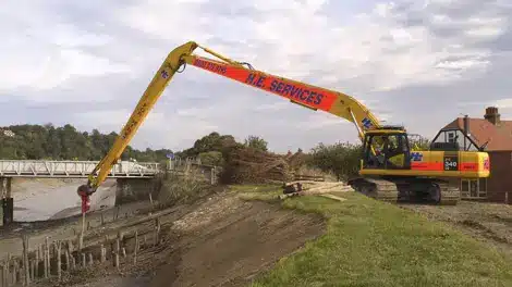
HE Services

Fowler Rental and Sales

Baldwins Crane Hire Ltd

Banner Plant


SGB Hire

Bouygues TPRF
Ready to elevate your rental business?
Connect with our expert team to discover how MCS Rental Software can drive your success. We’re here to answer your questions and help you find the perfect solution.
